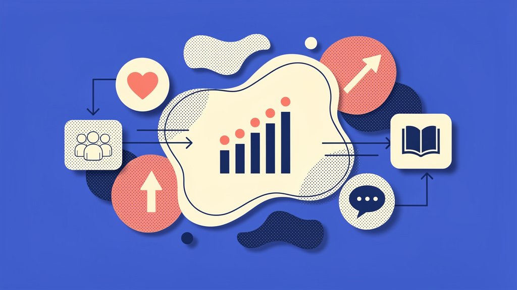
Your latest donor database export sits there: rows and rows of numbers that should excite you. After all, they represent real people making real change. But when you paste those figures into your next board presentation or fundraising appeal, eyes glaze over. The data’s powerful, the impact undeniable, yet somehow, the message falls flat.
Here’s the thing: you can transform raw donor metrics and impact data into compelling visuals that actually boost engagement, retention, and fundraising results. This isn’t just about making pretty charts. It’s about turning spreadsheets into donor magnets that drive action and revenue.
Why Data Visualization Drives Fundraising Success
Look, here’s a truth that should reshape how you communicate with stakeholders: humans process visuals 60,000 times quicker than text (Constructive). When you’re competing for donor attention against countless other causes, speed matters.
Effective data visualization helps you communicate complex impact faster, fostering emotional connections and action. Think about what this means for your mission:
- boosts donor trust: visuals like donor heatmaps reveal engagement patterns, showing exactly how gifts create tangible change,
- highlights trends: line graphs tracking recurring revenue growth prove program ROI at a glance,
- simplifies reports: infographics replace lengthy PDFs, increasing read-through by up to 70% (Wired Impact).
Organizations using Funraise’s Fundraising Intelligence dashboards achieve 73% annual online revenue growth, far outpacing industry averages (Funraise, Sisense). That’s not coincidental. When you visualize the right data in the right way, donors understand their impact immediately and give more generously.
Protip: Test visuals with 5 non-experts from outside your organization. If they grasp the story in 10 seconds, it’s ready for your next board deck or donor newsletter.
Core Principles of Nonprofit Data Storytelling
Start with your audience’s needs: tailor visuals to answer “So what?” for donors, not just display numbers. The most common mistake we see is nonprofits creating charts that showcase internal metrics without translating them into donor-facing impact.
Ethical data visualization avoids clutter, using color sparingly to evoke mission-aligned emotions like hope or urgency. Combine narrative arcs: introduce the problem with stats, show progress via bars or timelines, and end with a clear call to action.
| Principle | Best Practice | Example Visual |
|---|---|---|
| Simplicity | Limit to 3-5 data points per chart | Progress thermometer for campaign goals |
| Context | Pair numbers with stories | Donor heatmap + beneficiary photo |
| Accessibility | Use alt text, high contrast | Screen-reader friendly pie charts |
| Honesty | Avoid misleading scales | Consistent axes in trend lines |
These principles apply whether you’re creating a one-page infographic for social media or an interactive dashboard for major donors. The foundation stays the same: clarity, honesty, and purpose.
Common Challenges We See Daily
In our experience, before nonprofits switch to platforms like Funraise (or even while learning to use our tools effectively), we encounter some familiar struggles.
The Excel Overwhelm: A development director spends 6 hours manually creating charts from donor exports, only to realize the format doesn’t work for their email platform. By the time they fix it, campaign momentum’s passed.
The Misleading Metric: An organization proudly displays a pie chart showing “95% program spending” without realizing the 3D effect and poor color contrast makes it unreadable on mobile devices, where 60% of their donors view emails.
The Data Graveyard: Teams collect mountains of donor data but never visualize it beyond basic spreadsheet totals, missing patterns like geographic clustering or seasonal giving trends that could transform their strategy.
The Static Trap: Annual reports get designed as beautiful PDFs with charts frozen in time, when interactive dashboards would let donors explore impact on their own terms and share specific findings with their networks.
These aren’t failures of effort or intention. They’re symptoms of working with tools not built for nonprofit storytelling. Effective communication requires a strategic approach, one that understands the power of engaging stories for nonprofit emails. By tapping into the emotional core of a cause, organizations can connect with their audience on a deeper level. It’s not just about asking for support; it’s about sharing a vision that inspires action and builds community.
Essential Chart Types for Donor Data
Choose charts by data type: bars for comparisons, lines for trends, pies for simple allocations. Platforms like Funraise auto-suggest formats based on your metrics, eliminating guesswork.
- bar charts: compare campaign ROI, for example, events versus online giving performance,
- line graphs: track donation trends over time, spotting seasonal peaks for strategic planning,
- pie charts: show fund allocation breakdowns (80% programs, 20% administrative costs),
- heatmaps: reveal geographic donor density for targeted regional appeals.
Protip: Gamify your visualization strategy with progress thermometers or anonymized donor “leaderboards” to spark healthy competition in peer-to-peer campaigns. These unconventional formats can boost participation by making progress tangible and social.
Funraise’s tools deliver 50% donation form conversion rates, visualized in real-time dashboards that directly link page views to completed gifts (Funraise). When you can see which elements drive action, you optimize faster.
AI-Powered Prompt for Instant Data Storytelling
Ready to transform your next dataset into a compelling narrative? Copy and paste this prompt into ChatGPT, Claude, Gemini, or your preferred AI model:
I need to visualize nonprofit data for [DONOR SEGMENT/BOARD/SOCIAL MEDIA]. My dataset shows [BRIEF DESCRIPTION OF DATA, e.g., 'monthly recurring gifts over 12 months']. My organization's mission focuses on [YOUR CAUSE]. The emotional response I want to create is [INSPIRATION/URGENCY/GRATITUDE].

Suggest three specific chart types with explanations for why each would work, plus headline copy that turns the data into a donor-centered story. Include one unconventional visualization idea that could increase social sharing.
Variables to customize:
- Your target audience
- Brief data description
- Your cause/mission
- Desired emotional response
While AI tools provide excellent brainstorming support, remember that in your daily fundraising work, integrated solutions like Funraise deliver AI capabilities built directly into your workflow with full context of your donor database, campaign history, and organizational goals. That contextual advantage means smarter suggestions and faster implementation.
“Data without context is just noise. The nonprofits winning in today’s landscape are those translating metrics into meaning, showing donors not just what happened, but why it matters and how they’re part of the story.”
Funraise CEO Justin Wheeler
Advanced Tools and Platforms Tailored for Nonprofits
Leverage integrated platforms like Funraise for drag-and-drop dashboards over generic tools like Excel. While spreadsheet software has its place, it wasn’t designed for fundraising storytelling. Purpose-built nonprofit platforms save hours on manual exports and deliver branded, shareable visuals automatically.
| Tool | Key Features | Nonprofit Fit |
|---|---|---|
| Funraise | Donor heatmaps, AI-suggested charts, recurring trends | Seamless CRM integration, 73% growth boost |
| Flourish | Scrollytelling, interactive animations | Great for impact stories on websites |
| Infogram | Quick maps, pre-built templates | Free tier available for small teams |
| Tableau Public | Advanced filtering capabilities | Free but steeper learning curve |
Organizations using Funraise analytics raise 7x more online annually and see 1.5x recurring revenue growth with 12% better donor retention compared to industry benchmarks (Sisense). These aren’t minor improvements. They represent the difference between stagnant fundraising and transformational growth.
The best part? You can start with Funraise’s free tier, exploring visualization features with no commitment before scaling up as your needs grow.
Real-World Applications in Fundraising
Apply visualization to campaigns: update donors mid-drive with live progress bars to sustain momentum. Static appeals that say “we need $50,000” pale compared to dynamic visuals showing “we’re 67% there. your gift right now closes the gap.”
For year-end reviews, blend timelines of milestones with beneficiary statistics:
- campaign launches: create shareable infographics projecting specific impact (e.g., “$10k feeds 500 families for a month”),
- event recaps: use Sankey diagrams tracing ticket sales to program outcomes,
- annual reports: deploy interactive maps of service areas, humanizing geographic reach.
Try this unconventional twist: animate data journeys showing poverty reduction paths, making each stage clickable to reveal underlying statistics. This approach can boost social shares by 30% (Flourish).
Research shows story-driven visualization with data increases donations 50% over statistics alone (Help You Sponsor). Numbers prove credibility. Stories create connection. Together, they become irresistible.
Protip: Embed live dashboards in donor portals. Funraise users report 20% higher repeat gifts when supporters can access personalized giving impact visualizations on demand.
Measuring Visualization ROI and Iterating
Track lift: compare engagement metrics pre and post-visualization implementation. Specifically, monitor clicks, shares, and completed gifts. Tools like Google Analytics pair with donor CRMs for full-funnel views that connect chart impressions to revenue.
Metrics to watch closely:
- conversion uplift: did visualization increase donation form completion rates?,
- retention rates: are donors who engage with visual reports giving again?,
- report downloads: which formats get saved and shared most?
Funraise users with active dashboard engagement enjoy 12% higher year-over-year donor retention (Sisense). That compounds dramatically over a donor’s lifetime value.
Survey recipients quarterly. Ask what visuals clarified impact versus which confused them. Refine based on actual feedback, not assumptions.
Protip: Conduct quarterly audits where you swap underperforming chart types. For instance, if standard bar charts get minimal engagement, test heatmaps that often show 2x higher interaction rates.
Avoiding Common Visualization Pitfalls
Steer clear of 3D charts or rainbow color schemes. They distort data and confuse donors. Overloading slides with multiple competing visuals kills engagement. Aim for one clear insight per visualization.
Fix these frequent mistakes:
- pitfall: no context → fix: always benchmark against industry averages or prior periods,
- pitfall: static files only → fix: embed interactive links that let donors explore,
- pitfall: ignoring mobile viewers → fix: use responsive designs that adapt to screen sizes.
Funraise’s pre-built templates prevent these issues automatically, letting your team focus on strategy and storytelling rather than technical formatting.
Moving from Numbers to Narrative
Data visualization isn’t optional anymore for nonprofits serious about growth. It’s how you prove impact amid tight budgets, turning skeptics into sustained supporters. Dashboards for nonprofits provide an intuitive way to present data, making complex information easily digestible. These tools allow organizations to track their progress and adjust strategies in real time, ensuring that every dollar spent drives meaningful change. By utilizing such resources, nonprofits can enhance transparency and foster trust with their stakeholders.
Start small: Pick one dataset you already track. Choose one appropriate chart type. Tell one compelling story. Then measure what happens to engagement and revenue.
The nonprofits raising more money aren’t necessarily those with bigger budgets or flashier missions. They’re the ones communicating impact so clearly that giving becomes irresistible. When donors see exactly how their contribution fits into a larger success story, visualized in seconds rather than buried in paragraphs, they give more and they give again.
Ready to transform your data into donor action? Explore how Funraise’s visualization tools can amplify your impact storytelling. With a free tier to start and no commitments required, there’s no barrier to discovering how the right charts can reshape your fundraising results.
Your numbers already tell an incredible story. It’s time to help your donors see it.
About the Author
Dashboards for Nonprofit Leadership: 5 Examples of Clear Reporting
You know that sinking feeling when a board member asks about donor retention and you realize your latest numbers are three weeks old, buried in a spreadsheet you haven't had time to update? Yeah, we've all been there. The good news is that dashboards can transform how you track what matters, turning overwhelming data into…

10 Critical KPIs for Nonprofits to Track in 2026
Look, nonprofit leaders are juggling a lot right now. Economic uncertainty, donor fatigue, transparency demands. It's a lot. And with giving growth projecting at a modest 2-4% (BDO Insights), tracking the right nonprofit KPIs isn't just smart management anymore. It's how you survive. Here's the thing: think of KPIs as your nonprofit's vital signs. Just…

How to Track and Evaluate Peer-to-Peer Campaigns with Dashboards
Peer-to-peer fundraising can seriously expand your donor network and generate revenue momentum like few other strategies out there. But here's what we see constantly at Funraise: nonprofit leaders drowning in spreadsheets, manually updating numbers across multiple platforms, and making critical campaign decisions based on week-old data. Success in peer-to-peer fundraising depends on one critical factor:…