Okay, so let’s talk about something that might seem almost too simple to matter: the relationship between your donate button and your donation form. Most nonprofits treat these two things as basically the same, or at least as minor details in the bigger fundraising picture. But here’s the thing, getting this relationship wrong is one of the quietest, most consistent ways organizations lose revenue they never even knew was within reach.
In this piece, we’re going to walk through exactly how buttons and forms differ, where most nonprofits go sideways with both, and what a genuinely connected giving experience looks like when it’s working well. Think of it as a li’l audit-in-article-form. By the end, you’ll have a clear sense of what to fix first.
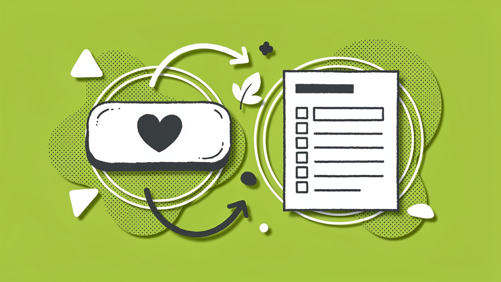
The Core Distinction (and Why It Matters More Than You Think)
A donation button is the entry point. It’s the clickable element that kicks off the giving process, visible on your homepage, in your emails, across your social channels. A donation form, on the other hand, is the actual interface where donors complete their contribution, entering payment details, selecting amounts, and confirming their gift. (Funraise Blog, 2024)
Simple enough, right? But here’s where things get messy: nonprofits either treat these as interchangeable, or they over-complicate the path between them. The Hoover Institution tested what happens when you remove the “ways to give” intermediary page and send your donate button directly to a donation form. The result was an 85% increase in donor conversion rates with a 99.6% level of confidence. (NextAfter, 2024) That’s not a rounding error. And honestly, once you think about donor psychology, it makes total sense: when someone clicks “Donate,” they’re ready. Every extra click you add is a chance for them to reconsider.
Side-by-Side: Button vs. Form at a Glance
| Element | Donation Button | Donation Form |
|---|---|---|
| Primary function | Initiates the giving process | Completes the transaction |
| Placement | Homepage, emails, social, sidebars | Post-click; embedded or dedicated page |
| Donor experience | One-click action | Multi-step data entry |
| Best used for | Awareness and calls-to-action | Capturing payments and donor data |
| Key optimization metric | Click-through rate | Conversion rate and average gift |
The industry average conversion rate for nonprofit donation forms sits at 11% on desktop and 8% on mobile (M+R Benchmarks via Blackbaud, 2025), but we’ve seen the ceiling go much, much higher. Funraise clients achieve a 50% donation form conversion rate (Funraise Blog, 2024), which tells you just how much room most organizations have to grow.
Protip: Run an A/B test directing one segment of traffic to a “ways to give” page and another directly to your best-performing donation form. Even a 10-15% improvement in conversion, compounded across a full year of campaigns, can mean thousands in additional revenue.
Types of Buttons and Forms: Know Your Options
Donation Buttons
- standard homepage button placed in persistent navigation,
- contextual buttons embedded within impact stories for emotional timing,
- floating/sticky buttons that stay visible as donors scroll,
- email CTA buttons since 33% of donors say email is the tool that most inspires them to give (NPTech for Good, 2024).
Donation Forms
- embedded forms that live directly on your site without redirecting donors,
- pop-up/contextual forms that appear as overlays while donors stay within your content,
- multi-step forms that break giving into sequential screens to reduce cognitive load,
- mobile-optimized forms built for touch interactions and smaller screens,
- event forms that integrate ticket purchases with donation options.
Best Practices for Donation Buttons
Your donate button is the gateway, so let’s make sure it’s doing its job.
Make it impossible to miss. Use contrasting colors, action-driven copy (“Donate Now,” “Make an Impact,” “Feed a Family Today”), and place it above the fold. And don’t stop at the header. Adding buttons contextually within your impact content, right where donor emotion peaks, can make a real difference.
Optimize ruthlessly for mobile. With 45% of online donations made on mobile devices in 2024 (NPTech for Good, 2024), buttons that are hard to tap on a small screen are quietly losing you gifts every single day. Size matters. Spacing matters. Both deserve attention.
Point directly to your form. Based on the Hoover Institution data we mentioned above, this single change might be the highest-ROI move you make this year. Seriously, don’t overthink it.
AI Prompt: Optimize Your Donation Page Experience
Copy and paste this prompt directly into your preferred AI tool (ChatGPT, Claude, Gemini, Perplexity, or any other) to get a customized donation experience audit:
I manage digital fundraising for [NONPROFIT NAME], a [MISSION/CAUSE TYPE] organization. Our current donation page receives approximately [MONTHLY VISITORS] unique visitors per month but converts at only [CURRENT CONVERSION RATE]%. Please audit our donation button and form strategy based on current nonprofit best practices. Suggest specific improvements for our button placement, form structure, mobile experience, and psychological triggers we should incorporate to increase both conversion rate and average gift size. Prioritize changes by expected impact.While AI prompts like this are great for generating ideas, in day-to-day nonprofit work there’s a clear advantage to using platforms like Funraise that have AI-powered capabilities built directly into the fundraising workflow, providing full operational context instead of requiring you to manually brief a separate tool every time.
Best Practices for Donation Forms
This is where most nonprofits leave the most money on the table, so we’re going to spend some real time here.
Reduce friction aggressively. In one well-documented case, reducing form fields from 11 to 4 led to a 120% increase in conversions. (GoFundMe Pro Blog, 2025) Every field you keep should earn its place. Non-critical questions like mailing address? Move those to post-donation screens.
Go multi-step. Multi-step donation forms show a 75% higher form conversion rate and a 54% higher average donation compared to single-page forms. (Funraise Blog, 2024) Breaking the process into logical stages (amount, frequency, payment, confirmation) reduces cognitive overload and guides donors through naturally. It sounds almost too simple, but the data keeps backing it up.
Frame amounts around impact, not dollars. “$25 feeds 5 families this week” converts differently than a plain “$25.” Pair this with a suggested ask array that personalizes amounts based on donor history and you’ve got a genuinely compelling combination.
Support every payment method your donors use. Credit cards, ACH, PayPal, Venmo, Apple Pay, Google Pay. Mobile-first donors especially expect one-tap options, so if they’re not available, you’re creating unnecessary friction at the worst possible moment.
Brand your form to match your site. Consistent logos, colors, and messaging from the donate button all the way through to the confirmation page builds trust and removes that “wait, am I still in the right place?” hesitation that quietly kills conversions.
Protip: Implement abandoned donation recovery emails. Up to 70% of visitors who begin an online donation don’t complete it. (Payroc Blog, 2025) A well-timed reminder to donors who started but didn’t finish can recover a meaningful slice of those gifts with minimal effort.
Real Challenges We See Every Day
Before we get into the integrated strategy, it’s worth being honest about what actually goes wrong in practice, because these are patterns we run into all the time.
The “beautiful but broken” donation page. A nonprofit invests in a stunning website redesign, but their donation form lives on a third-party platform that looks nothing like their brand. Donors click “Donate,” land somewhere that feels unfamiliar, and abandon at 60%+ rates.
The mobile blind spot. An organization’s executive director checks their donation page on a desktop every week. It looks great. But 45% of their donors are on iPhones, pinching and zooming through fields designed for a 1440px screen. Nobody notices until the numbers dip.
The “just one more field” problem. A well-meaning development team adds fields to capture more data: phone number, how did you hear about us, preferred contact method. Within two months, form abandonment climbs 30%, but no one connects the dots.
The intermediary page trap. Instead of sending donors directly to the form, the donate button leads to a “How to Give” page with five options. Donors who were ready to give now have to make another decision, and many simply don’t.
“The best donation experience is one where the donor barely notices the technology. Friction is the enemy of generosity.”
Funraise CEO Justin Wheeler
The Integrated Strategy: Making Buttons and Forms Work Together
The most effective nonprofits we’ve seen don’t think about buttons and forms as separate problems. They build a connected giving journey, and that shift in thinking changes everything.
Here’s what that looks like in practice:
- multiple entry points across website, email, and social, all pointing directly to forms,
- contextual triggers that surface donation opportunities at emotional peaks within content,
- mobile-first design for both elements, tested regularly on actual devices,
- data integration so every completed form feeds your CRM and enables future personalization,
- continuous measurement of click-through rate on buttons and conversion rate on forms separately, so you always know which element needs attention.
If your current platform makes any of this difficult, that friction compounds across every campaign you run. Platforms like Funraise are built to make this integration seamless, and you can start exploring it for free with no commitment required, which makes it well worth testing before your next major campaign.
Your Next Steps
Audit your donation button placement today. Count how many clicks stand between a motivated visitor and a completed gift. Then look at your form: how many fields, how many pages, how does it look on a phone?
The benchmarks, the case studies, and the data all point in the same direction: simplicity converts. And every li’l bit of friction you remove is a gift you’re no longer leaving on the table.
About the Author

How to Create a Donation Page That Actually Converts
Your donation page is doing more work than you might realize. It's not just a form sitting at the end of a campaign email. It's the moment a potential supporter decides whether your mission is worth their trust, their time, and yes, their money. And yet, for so many nonprofits, it's also the most overlooked…

10 Brilliant Nonprofit Donation Page Tips and Strategies
Nonprofits pour enormous energy into their missions, their campaigns, their storytelling. And then a potential donor lands on the donation page and… nothing. The moment of giving slips away quietly, without fanfare, without explanation. It happens more than most fundraising teams realize, and the frustrating part is that it's almost entirely preventable. So that's what…

11 Pro Tips for Accepting Donations Online in 2026
Common Challenges We See Daily Before we jump into solutions, let's talk about what's really happening out there. We've worked with thousands of organizations making the switch to better systems, and honestly? The same pain points come up over and over: The Multi-Tool Nightmare : You've got one platform for donation forms, another for email,…