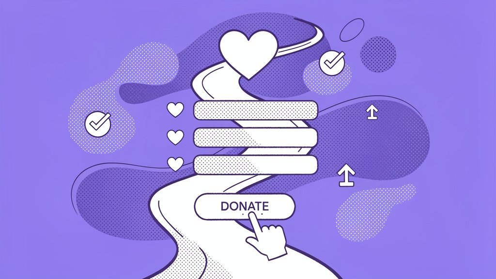
You’ve perfected your case for support. Your campaign messaging resonates deeply. Your email open rates are climbing. Yet somehow, 89% of visitors who click through to your donation page vanish before completing a gift.
Here’s the thing: in modern fundraising, the “Giving Experience” often trumps the “Ask” itself. While most nonprofits obsess over crafting the perfect appeal, they’re hemorrhaging potential revenue through clunky, outdated donation forms. In this piece, we’ll explore the technical and psychological architecture behind frictionless giving and show you how to transform your donation experience from conversion killer to revenue multiplier.
Why Friction Murders Your Mission
Think about your last Amazon purchase. One click. Auto-filled shipping. Saved payment method. Done in seconds.
Now think about your donation form. Multiple pages? Manual address entry? Confusing navigation? Credit card typos requiring re-entry?
Friction in donation forms drives away 83-89% of motivated visitors before they give (Better Giving analysis). These aren’t casual browsers, by the way. They’re supporters who clicked your CTA, read your story, and decided to donate. Then your form made them work too hard.
The psychology is brutal: each additional form field triggers decision fatigue. Each redirect to external payment processors breaks commitment momentum. Each mobile layout that requires pinch-zooming creates abandonment triggers. Research confirms that reducing form fields from 11 to 4 can boost conversions by 120% (GoFundMe Pro study).
Key friction points sabotaging your conversions:
- excessive form fields demanding unnecessary data upfront (job title? company name? really?),
- payment redirects forcing donors to leave your branded experience,
- mobile hostility when 97% of Americans now donate from phones (Funraise data),
- no auto-save functionality, requiring donors to restart after browser crashes.
Industry benchmarks show average nonprofit forms convert at just 11% on desktop and 8% on mobile (M+R Benchmarks Study). But organizations using optimized, branded forms? They’re hitting up to 50% donation form conversion rates. That’s not a typo. Well-optimized pages typically hit 15-25% conversion rates industry-wide, while Funraise users shatter expectations with 50% for interacting visitors. The difference? Systematic friction removal at every touchpoint.
The Daily Struggles We See (And Fix)
Look, before nonprofits switch to Funraise, we consistently hear these conversion nightmares:
The Mobile Maze: A children’s literacy nonprofit running Facebook ads discovered 87% of clicks came from mobile devices, yet their desktop-first donation form converted at just 3% on phones. Thumb-friendly buttons? Nonexistent. Auto-fill? Not configured. They were literally paying for traffic they couldn’t convert.
The Redirect Disaster: An environmental organization using third-party payment processors watched donors abandon at the handoff moment. The visual disconnect between their branded appeal and generic payment page destroyed trust right before transaction completion.
The Field Overload: A health-focused nonprofit required 14 fields for first-time donors, including employer matching information that applied to fewer than 8% of their donor base. Their form converted at 6%. After streamlining to 4 essential fields, conversions jumped to 19%.
These aren’t edge cases. They’re daily realities in nonprofit fundraising, and they’re costing missions millions in unrealized revenue.
Technical Architecture of Frictionless Forms
The best donation experiences feel invisible. Donors shouldn’t notice your form. They should notice how easy giving felt.
Protip: Test single-page versus multi-step forms for your specific audience. In our experience, multi-step forms excel for mobile by creating transparency and progressive commitment without visual overwhelm. Funraise’s multi-step approach contributes directly to their 50% conversion benchmark.
Form Type Performance Comparison
| Form Type | Strengths | Weaknesses | Conversion Impact |
|---|---|---|---|
| Single-Page | Speed for desktop users | Overwhelming on mobile screens | Average 10-20% |
| Multi-Step | Builds psychological commitment | Requires extra clicks | Up to 50% (Funraise data) |
| Embedded Pop-up | Contextual, no redirect friction | Needs proper site integration | +78.4% total conversions |
Funraise’s embedded pop-up forms alone boosted one client’s total conversion by 78.4% and one-time gifts by 88.2% (Action Against Hunger case study). The secret? Keeping donors in-context while progressively revealing form complexity.
Mobile-first design principles:
- thumb-friendly buttons: large, high-contrast CTAs positioned in natural thumb-reach zones,
- adaptive layouts: single-column flows that eliminate horizontal scrolling,
- auto-fill integration: leveraging browser data to eliminate manual typing,
- payment method diversity: Apple Pay, Venmo, Google Pay for one-tap completion.
Speaking of payment methods, one-click options eliminate re-entry friction entirely. Funraise’s automatic card updater technology retains 80% of recurring revenue that would otherwise be lost to expired cards. That’s passive retention working while you sleep.
AI-Powered Form Optimization Prompt
Ready to audit your donation form for friction? Copy and paste this prompt into ChatGPT, Claude, Gemini, or your preferred AI assistant:
Analyze my nonprofit donation form for conversion friction. My organization type is [ORGANIZATION TYPE: e.g., "environmental nonprofit"], my average donation size is [AVERAGE GIFT: e.g., "$75"], my primary donor demographic is [DONOR PROFILE: e.g., "45-65 year old professionals"], and my current conversion rate is [CURRENT RATE: e.g., "9%"].

Provide:
1. Top 5 friction points likely reducing my conversions
2. Specific technical fixes ranked by implementation difficulty
3. Psychological triggers I should add to my form
4. A/B test recommendations to reach 20%+ conversion rates
While AI analysis provides valuable insights, daily workflow efficiency demands integrated solutions. Funraise embeds AI components directly into your fundraising platform, providing full operational context without switching between tools. This contextual intelligence powers personalized ask amounts, abandoned cart recovery, and real-time optimization, all working together to hit those 50% conversion rates.
The Psychology of Yes: Behavioral Nudges That Convert
Technical optimization removes barriers. Psychological design actively pulls donors forward.
Smart defaults work magic. Pre-checked recurring donation boxes lift monthly sign-ups by 35% without feeling pushy. Suggested donation amounts like $25, $50, $100 (with $50 as default) eliminate analysis paralysis while anchoring higher gifts.
“The organizations seeing exponential growth aren’t just asking better; they’re making giving irresistible through experience design that respects donor time and psychology.”
Funraise CEO Justin Wheeler
Conversion-driving psychological triggers:
Social Proof: “Join 5,234 donors this month” leverages herd mentality. Donors want to be part of movements, not isolated transactions.
Urgency Framing: “Matching gift expires in 3 hours” activates FOMO (yeah, we’re using that acronym) without manipulation.
Impact Visualization: “$50 provides clean water for 10 families for a month” makes abstract gifts tangible and emotionally resonant.
Personalization Through AI: Machine learning that suggests donation amounts based on past behavior increases relevance. Organizations using Funraise’s AI-powered personalization grow online revenue 73% year-over-year, which is three times the industry average.
Protip: Add “Cover processing fees?” checkboxes. Donors frequently opt-in (often at 30-50% rates), preserving your net revenue while framing the choice as amplified impact rather than administrative burden.
Payment Flexibility as Conversion Strategy
Credit cards aren’t enough anymore. Diversifying payment methods reduces abandonment by 20-30% by meeting donors where they already transact.
Modern high-converting forms offer:
- Apple Pay / Google Pay: one-touch completion for mobile users,
- Venmo: preferred by younger donors familiar with peer-to-peer payments,
- cryptocurrency: appeals to tech-forward supporters with appreciated assets,
- stock donations: high-value option with significant tax advantages,
- DAFpay integration: Donor-Advised Fund forwards enabling instant giving without new account creation.
Funraise provides all these options seamlessly, contributing directly to their 50% conversion benchmark. Payment flexibility isn’t about offering everything. It’s about reducing the friction between intent and completion for diverse donor preferences.
Your 16-Point Optimization Checklist
So we’ve aggregated these Funraise-inspired power-ups for conversion excellence:
Foundation Layer:
- multi-step mobile-optimized forms,
- embedded, branded payment processing,
- auto-save and abandonment recovery,
- one-click payment method integration.
Psychological Layer:
- smart default donation amounts,
- pre-checked recurring options,
- social proof counters,
- impact calculators showing gift outcomes.
Retention Layer:
- automatic card updating for recurring gifts,
- self-service donor portals,
- SMS follow-up (98% open rate vs. email’s 18%),
- premium thank-you experiences.
Advanced Optimization:
- thumb-zone heatmap testing: position CTAs where mobile thumbs naturally rest (lower half-screen),
- A/B testing protocols: regular experiments on fields, CTAs, and defaults yield 28-61% conversion lifts,
- abandoned cart sequences: automated recovery emails capturing donors who started but didn’t finish,
- recurring upgrade prompts: for gifts under $100, suggesting monthly options drives 52% annual recurring revenue growth (Funraise statistics).
Unconventional hack: Use actual thumb-zone heatmaps from mobile sessions to position your primary CTA exactly where users’ thumbs naturally hover. This micro-optimization alone can lift mobile conversions by 15-20%.
Measuring What Matters
Here’s something we’ve learned: you need to stop obsessing over vanity metrics. Revenue per visitor matters more than raw conversion percentage. A 50% conversion rate on $20 average gifts underperforms a 15% rate with $150 average gifts.
Track these critical metrics weekly:
- conversion rate by device (mobile vs. desktop vs. tablet),
- abandonment points (which specific form step loses donors),
- payment method distribution (are you missing preferred options?),
- load time impact (every second delay costs 7% of conversions).
Industry benchmarks suggest 10-20% conversion rates are solid for standard donation pages. Funraise consistently delivers 50% through holistic optimization, not from one magic trick but from systematic friction removal across every touchpoint.
Protip: Weekly audits through Google Analytics reveal gold mines. Segment mobile versus desktop drop-off points, then prioritize fixes for the highest-traffic friction zones first. Small improvements compound dramatically.
The Frictionless Future
Your mission deserves better than industry-average 8-11% conversion rates. Every percentage point improvement represents real resources for real impact. When the giving experience becomes as effortless as Amazon checkout, donor behavior transforms.
Organizations hitting 50% conversion rates aren’t lucky. They’re strategic. They’ve eliminated every unnecessary click, every confusing field, every moment of donor hesitation. They’ve replaced friction with flow.
The good news? You don’t need to build this infrastructure from scratch. Funraise’s platform delivers these optimizations out-of-the-box, with a free tier perfect for testing these principles without commitment. The better news? Your donors are ready to give generously. Your form just needs to get out of their way.
Master frictionless forms, and you’ll stop leaving money on the table. More importantly, you’ll honor donor intent by making their generosity as easy as their desire to help.
Ready to test these principles? Start with Funraise’s free tier and discover why organizations using optimized donation experiences don’t just meet fundraising goals. They shatter them.
About the Author
1) Why Most Nonprofit Strategies Fail: The Glass-Chewing Truth
You've sat through dozens of strategy meetings, right? Whiteboards covered in ambitious goals, spreadsheets showing exponential growth curves, slides promising transformational impact. Fast forward six months and, well, nothing's really changed. Revenue's stuck, your team's exhausted, and the mission feels like it's drifting. Here's the thing: most nonprofit strategies don't fail because of bad planning.…
2) Closing the Nonprofit Technology Gap: Stop Duct-Taping Your Mission
Your mission deserves better than patchwork tech held together with digital duct tape and prayers. Look, here's the thing. With over 1.4 million nonprofits in the US, most operating under $1M in annual revenue, the "technology gap" isn't just annoying. It's a systemic barrier that caps your impact before you even begin. In this guide,…
3) Modern Nonprofit Board Governance: Moving Boards to Mission Growth
Most nonprofit boards live in a state of financial anxiety, spending way more time worrying about budget cuts than imagining what transformational impact could look like. Here's the thing: board members are naturally cautious (it's basically written into their job description), but that defensiveness can freeze the very growth that'd make your mission stronger. So…