Most nonprofits know mobile giving matters. But knowing something matters and actually building for it are two very different things. There’s a gap between where donors are spending their time (on their phones, obviously) and where most donation forms were designed to live (on a tidy desktop screen with plenty of room to breathe). That gap is costing real money, and more importantly, real missed connections with people who genuinely wanted to give.
So let’s dig into the psychology behind why mobile donation forms succeed or fail, because it turns out this isn’t really a technology problem. It’s a human one. In this piece, we’ll walk through what’s actually going on in a mobile donor’s brain, which psychological triggers move people to complete a gift, and what you can do this week to start closing the conversion gap.
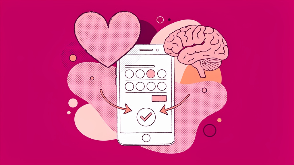
The Mobile Mindset: Why Donors Think Differently on Phones
Before fixing your form, it helps to picture who’s actually filling it out. Mobile donors are scanning, multitasking, and making emotionally-driven snap decisions. Research from Notre Dame confirms that smartphones actually reduce focus on others’ needs, which means your messaging has to work harder to create empathy in a compressed, distracted environment. That’s a tall order when someone’s half-watching TV and half-scrolling their feed.
This creates two distinct cognitive challenges worth naming. The first is attention scarcity. Mobile users won’t read, they skim. A wall of text, a cluttered layout, or a form that requires scrolling past three paragraphs to find the donate button kills momentum before it starts. The second is trust hesitation. Without visible security signals, mobile donors are quicker to bail. Scam awareness is high, and a form without an SSL badge or a privacy link near the payment field plants doubt at exactly the wrong moment. 51% of nonprofit website visits come from mobile devices (Nonprofits Source), yet unoptimized forms can cost organizations up to 126% in potential revenue simply by lacking responsive design (Nonprofits Source). That’s not a small rounding error. That’s your annual appeal.
Why Most Mobile Donation Forms Fail
Here’s the honest breakdown of where most forms collapse and what the psychology actually demands:
| Failure Factor | Why It Kills Conversions | The Fix |
|---|---|---|
| Long single-page forms | Overwhelms mobile users cognitively | Break into 3-4 steps: amount, info, payment |
| Slow load times | 50% of users abandon after 3 seconds (Share Services) | Compress assets, target under 2 seconds |
| Desktop-first layout | Tiny fields, horizontal scroll, cramped buttons | Vertical flow, minimum 48px button height |
| No psychological hooks | Nothing motivates or reassures the donor | Add progress bars, impact statements, social proof |
| Off-site redirects | Disrupts trust and flow, causes an 8% conversion drop | Embed forms directly on your site |
Nonprofits using strategic psychological triggers exceed 30% conversion rates during peak campaigns, compared to the 8% average (Blackbaud). The forms themselves aren’t really the issue. The strategy behind them is.
Protip: Pull out your phone right now and complete your own donation form as a first-time donor. Time yourself. If it takes more than 60 seconds from intent to confirmation, you’ve got a friction problem worth solving.
The Psychological Triggers That Actually Move Mobile Donors
High-converting mobile forms aren’t just cleaner. They’re built around how people actually decide to give. These are the behavioral levers that tend to matter most, in our experience.
Social proof does the heavy lifting on mobile because it removes uncertainty instantly. A simple counter like “1,247 donors have given this month” or a live feed showing “Sandra just gave $50” creates validation without requiring any extra cognitive effort from the donor. Think of it as the nonprofit version of a restaurant with a line out the door. Cheesy analogy, maybe, but it works.
Urgency and scarcity, used ethically, generate real momentum. Progress bars showing “80% to goal” trigger loss aversion because donors genuinely don’t want to be the reason a campaign falls short. Match deadlines amplify this further.
Impact visualization helps close the empathy gap that smartphones naturally open. Anchoring gift amounts to tangible outcomes, like “$25 feeds 50 families,” gives donors a mental image they can actually hold onto. Icons reinforce this without adding word count.
Smart defaults are one of the most underused tools in the whole fundraising toolkit. Pre-selecting a monthly giving option (with an easy opt-out) can increase recurring gift rates by 35% (WPCharitable). Donors often accept the default simply because choosing requires effort. That’s not manipulation. That’s good design working with human nature rather than against it.
And then there’s the IKEA effect, which applies here more than you’d think. When donors feel like they’re building something, selecting a program, choosing a project, personalizing their gift, they become more invested in completing the transaction. Participation creates ownership.
AI Prompt for Your Donation Form Strategy
Feeling stuck on how to restructure your form copy or gift ladder? Copy this prompt and paste it directly into ChatGPT, Gemini, Claude, or whichever AI model you use daily:
You are an expert in nonprofit fundraising psychology and mobile UX. Help me redesign the copy and structure of our mobile donation form for [ORGANIZATION NAME], which focuses on [CAUSE AREA]. Our current average gift is [AVERAGE GIFT AMOUNT]. Suggest an emotionally resonant impact-anchored gift ladder with 4-5 options, a one-sentence social proof statement, a progress-bar framing for our [CURRENT CAMPAIGN GOAL], and a two-step form structure that reduces cognitive load on mobile. Prioritize emotional triggers and thumb-friendly design.For day-to-day work like this, it’s worth exploring platforms like Funraise that have AI capabilities built directly into the fundraising workflow, giving you full operational context rather than a standalone chat window. That kind of embedded intelligence makes a real difference at scale.
What We See Every Day: Real Failures From Real Nonprofits
This is where things get uncomfortably familiar. We’re not sharing these to pile on anyone. These are just Tuesday.
“Our form looked fine on my computer.” A mid-sized environmental nonprofit came to us with a single-page form featuring eight required fields, a dropdown that required pinching and zooming, and a payment processor redirect. On desktop, it looked polished. On mobile, it was effectively a closed door.
“We didn’t know people were dropping off.” Without step-level analytics, many organizations only see total conversion, not where donors actually leave. One hunger-relief organization discovered that 60% of mobile users were abandoning specifically at the payment field. The culprit was a lack of digital wallet options. A fixable problem they didn’t know they had.
“We assumed monthly giving would confuse donors.” We hear this hesitation constantly. But when smart defaults are implemented thoughtfully, donors often welcome the simplicity rather than resist it. Action Against Hunger saw a 12.1% lift in monthly giving after implementing optimized form design through Funraise (Funraise Growth Statistics).
These patterns show up again and again, across organization sizes and cause areas. The good news is that they’re also very fixable once you know what to look for.
“The best donation form is one the donor never has to think about. Every field you remove, every step you simplify, every default you set thoughtfully — that’s not lazy design, that’s respect for your donor’s attention.”
Funraise CEO Justin Wheeler
Mobile UX Tactics That Deliver Measurable Lifts
Beyond psychology, the mechanics matter too. Enabling Apple Pay and Google Pay alone can drive 117% higher mobile subscription rates (Nonprofits Source). Digital wallets eliminate the single biggest point of friction: manually entering a 16-digit card number on a 6-inch screen. If you haven’t enabled them yet, that’s probably the highest-leverage hour you could spend this week.
A few other tactics worth jumping on:
- multi-step wizards consistently outperform single-page forms on mobile. Fidelco Guide Dogs saw measurable lifts after splitting their form into sequential steps (NextAfter),
- ask ladders anchored to impact boosted Seed Savers’ average gift by 61%, from $112 to $181 (NextAfter). That’s not a tweak. That’s a transformation,
- fee coverage options with an opt-out default result in a 90% opt-in rate, reducing net processing cost to approximately 1.5% (Funraise).
Funraise users grow online revenue 73% year-over-year on average, roughly three times the industry rate (Funraise Growth Statistics). The platform’s embedded and pop-up form options helped Action Against Hunger achieve 78% higher total conversions. If you haven’t explored what a properly configured form can do, Funraise offers a free tier with no commitment required. Probably worth an hour of your time.
The One Thing to Implement This Week
Look, we get it. Overhauling everything at once sounds exhausting. So don’t. Start with just two changes: add an impact-anchored gift ladder and a visual progress bar. These two elements alone have produced conversion lifts of 20% or more for nonprofits implementing them mid-campaign (WPCharitable).
Mobile giving rose 50% in 2024. The donors are out there, phones in hand, ready to give. The only question is whether your form is ready to meet them where they are.
About the Author

Nonprofit Fundraising Strategy: The Psychology Frameworks Behind Sustainable Revenue
Fundraising has always been about people. Not spreadsheets, not campaign calendars, not even donor databases. At its core, it's about understanding what moves someone to open their wallet for a cause they believe in and, more importantly, what keeps them coming back. And here's the thing: behavioral science has actually done a lot of that…

Fundraising Gala Psychology: Why Black-Tie Still Outperforms in Major Donor Strategy
There's something almost counterintuitive about the fact that, in a world of viral fundraising challenges and slick crowdfunding pages, the classic black-tie gala keeps holding its ground. But here's the thing: it's not stubbornness or nostalgia keeping it alive. It's psychology. The formal charity dinner does something to donors' brains that a casual peer-to-peer run…

Best Nonprofit CRMs to Grow Your Major Gifts Pipeline
Why Your Pipeline Needs More Than a Spreadsheet Here's the sobering reality: overall donor retention hovers around 32% , and first-time donor retention falls below 25% (Virtuous). That means your major gifts pipeline is constantly leaking, and a spreadsheet simply can't tell you who's about to slip away. The good news is that nonprofits investing…